IAN WICENSKI

RIVE
Personal
Branding
01
DESIGN
CHALLENGE
This project focused on using Rive to create an interactive element for my portfolio website, enhancing the branding.


Screenshot from https://kotaiguchi.jp/ showing color changing mouse interaction.
Lava Lamp effect using gradients and blend modes on Rive marketplace. Try it on Rive here
02
RESEARCH
& IDEATION
Research for this project involved analyzing the layouts and design elements used on various websites that I feel suit my personality. I also visited Rive's marketplace to get hands on experience with community made interactive features and get an idea for the kinds of interactivity which resonate with me.
03
INITIAL CONCEPTS
Sunrise/sunset
Metal/hardcore
The look and feel of this concept are inspired by my experiences watching sunrises and sunsets. They have a sublime ambient quality which I want to bring to my website using softness and analogous colors present in those natural occurances.
A less colorful concept, inspired by one of my favorite genres of music, this concept can employ the phenomenon of synesthesia, the inspiration of imagined visuals stemming from sounds, to engage the user. The interactivity envisioned here is lightning and holographic effects emerging from page elements which trigger diagetic synthesizer sound effects.
The interactivity concept here had involved much more of a visual system, yet it's pitched elements lacked the level of novelty I was looking for. My creative team had suggested moving toward a more simplistic concept that doesn't involve transitions between pages to maintain functionality. I agreed and decided upon an animated, interactive wordmark.
Unfortunately this concept could not move on due to its reliance on raster effects, which my creative team suggested may take too long to make appealing using Rive during the project duration.


04
RETHINKING CONCEPT 01
Using input from my creative team I decided to revisit the design of the type. I took another look at my webpage inspirations and noticed the majority use sans-serif type to strengthen readability. The simple geometric form makes it readable on small screens and the lineweight of the bold variety offers enough visual real-estate for interesting animation masked within the typography.
After another round of type experimentation I landed on the font Lato bold. This is great for legibility while still providing enough visual real-estate for interesting animation masked
within my wordmark.
Lato Bold
05
ANIMATING
IN RIVE
(AND USING THE
STATE MACHINE)
Animation itself has come fairly intuitively to me in Rive, being similar to both After Effects and Cinema4D in several ways. The state machine, on the other hand, has been much more challenging for me to get working. Rive's state machine allows a designer to add inputs and responses into their animations

06
FINAL RESULT (interactive)
07
REFLECTIONS
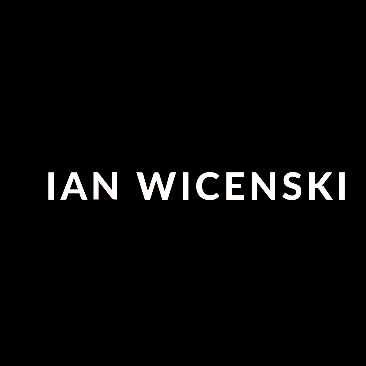
This project has been a great exercise in using Rive. As a final observation, while I am proud of my wordmark animation, I agree with my art director's input that having the wordmark visible on frame 1 makes a stronger brand appearance. I wanted to follow through on fully animating the name to add more personal expression as well as audience engagement, yet I can see now that I feel it contradicts the function of a wordmark in a way.
The wordmark result I ended up with is something I find visually pleasing, and I am happy with the function o the interactivity I created. The state machine was fascinating to troubleshoot and very gratifying to see function.
Grammy (brief 03)>